Azure Charts
In this blog post I share how the Azure Charts website can help you stay up to date with Azure.

A question I get asked all the time is how I stay up to date with all the features and announcements that happen for Azure products. Something that I have within my arsenal to help me keep up to date is the Azure Charts or Azure Heat Map.
The Azure Chart is a website that a Microsoft employee, Alexey Polkovnikov has developed as side project. Utilising public updates, RSS channels and web pages as data sources the Azure Chart website tries to pull together all Azure news, stats and changes.
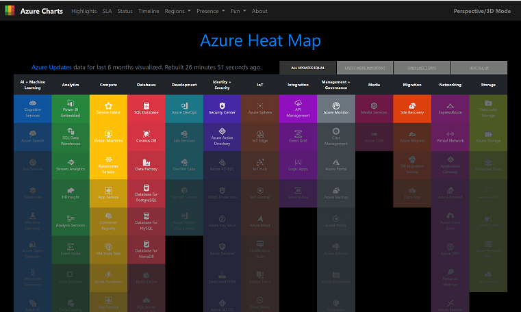
There are many features on the website but my favourite is the Azure Heat Map.
The Azure Heat Map is a great visualisation of the latest changes to the Azure products. The website lists all the Azure services and then highlights those in a bright colour that have an update and darkens those that haven't. You can then click on the tile for that product and it takes you to the new story on the official Microsoft website so you can find out what the update was.
My favourite view is the "last 7 day" update view. Which helps me focus on the latest updates without being overwhelmed. It's a great view if you've been off on an annual leave for a few days or a week and need to catch up on what has happened while you were offline.
The website also has other features, another I like to use is the Azure Region Scope. This allows you to pick an Azure region and then discover which services are available there and if they are generally available (GA) or within preview. Again great for understanding what is available and can be really useful when you are architecting solutions.
Overall, the Azure Charts website is a useful resource and show be within your Internet favourites at all times.